top of page
BRAND IDENTITY · MAYDER
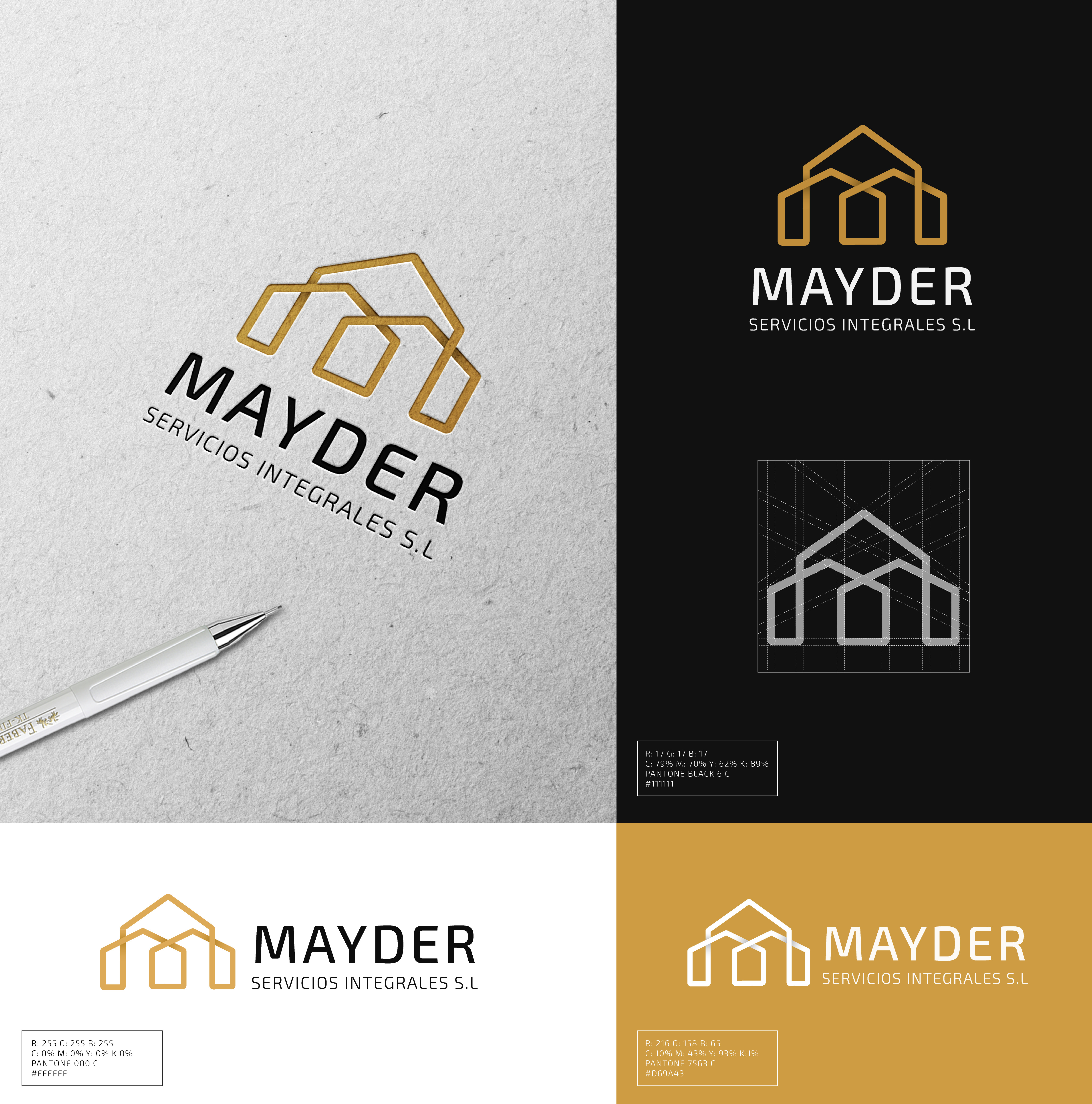
Development of the complete visual identity for a construction services company, based on a geometric symbol inspired by architecture and structures. The combination of black, white and gold creates a solid, technical and professional image.
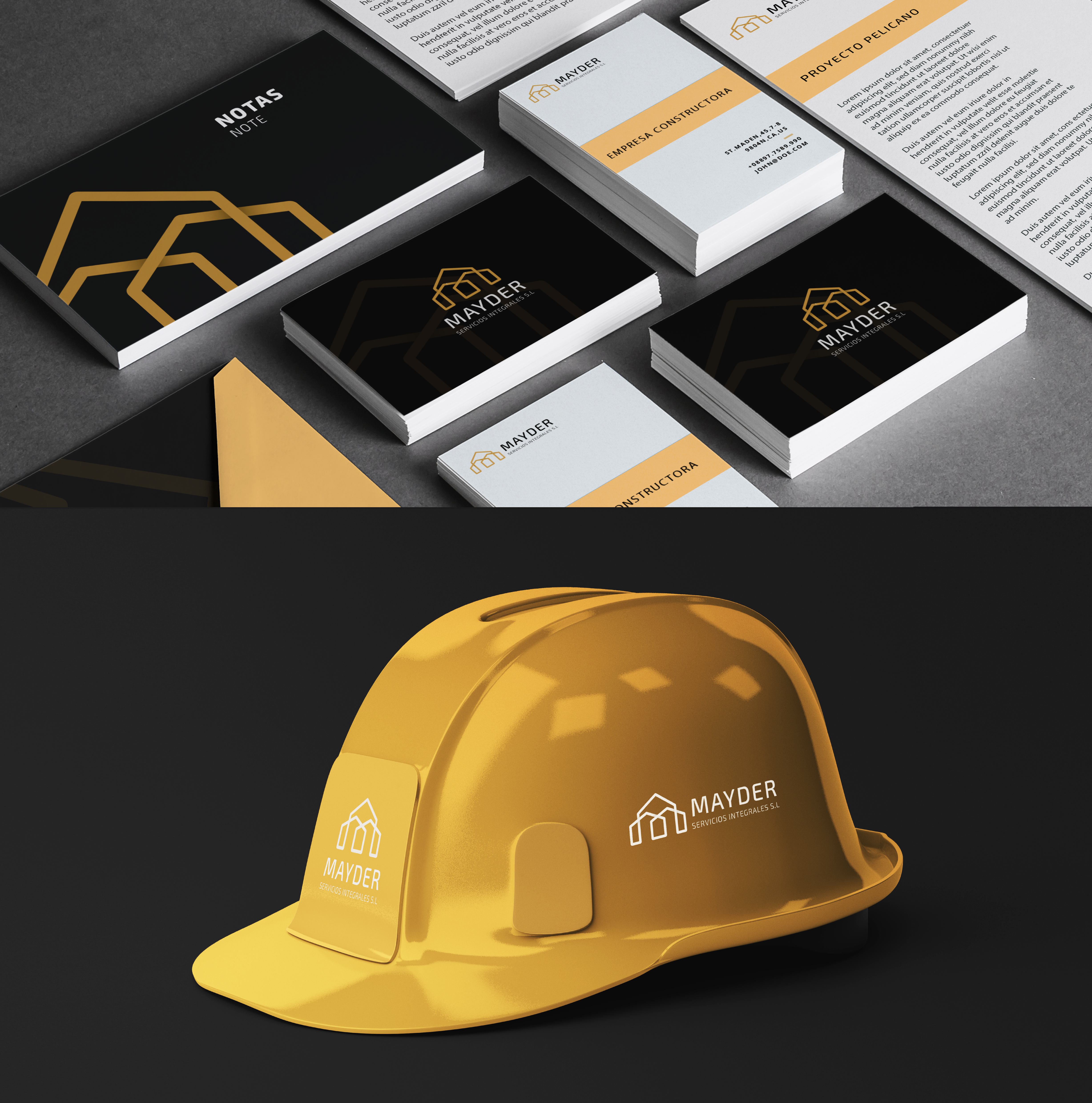
The project includes the graphic system, corporate applications and identity elements, from stationery and business cards to merchandising and workwear, ensuring a coherent, recognisable identity adaptable to different media.

01
BRAND IDENTITY · MAYDER


bottom of page